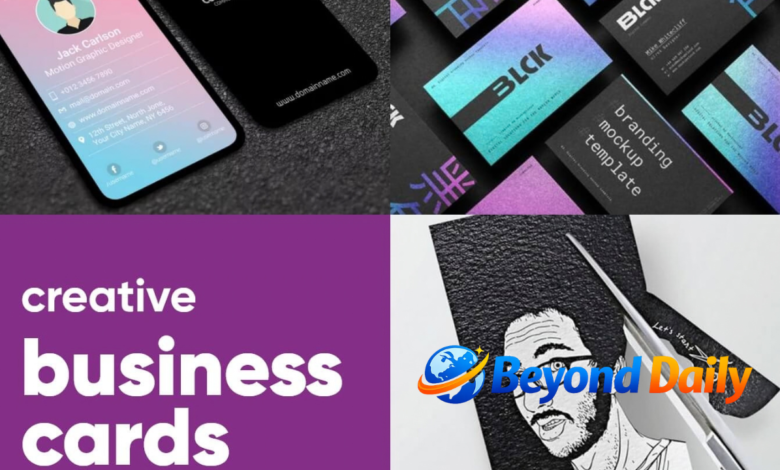
A creative business card may be small, but it can carry a surprisingly powerful message about a company, freelancer or personal brand. A thoughtful design can introduce your work, communicate your personality and make it easier for someone to remember you after a meeting. The key is finding the right balance between originality and usefulness, so the card looks distinctive without becoming difficult to read or use.
Modern business cards offer far more creative possibilities than a standard rectangle with a logo and contact details. You can experiment with typography, colours, imagery, layouts, materials, finishes and even unusual shapes. Whether you need something artistic, elegant, playful or highly professional, the right approach starts with understanding your brand and the impression you want to create.
What Makes a Business Card Creative and Effective
The most effective designs usually begin with a clear purpose. Your name, business name, role and essential contact details should remain easy to find, while supporting elements give the card its personality. A creative design should not make someone search for your phone number, email address or website. Instead, creativity should guide attention towards the information that matters most.
Brand consistency is equally important. Your card should feel connected to your website, packaging, social profiles and other marketing materials through colours, fonts, imagery or visual style. Adobe’s current design guidance similarly highlights branding, readable information, typography, imagery and balanced layouts as important elements of a strong business card. A memorable card is therefore not simply unusual; it should look like a natural extension of the brand.
Creative Business Card Ideas for Different Brands
One of the easiest ways to develop a distinctive concept is to connect the design with what the business actually does. A photographer could use a striking image, an architect might incorporate blueprint-inspired lines, while a florist could use botanical illustrations. A creative agency may prefer bold typography and unexpected composition. When the visual idea relates to the service, the card can communicate something meaningful before a conversation even begins.
There are plenty of ways to experiment without making the design overwhelming. Consider a strong colour block, an unusual crop, a memorable illustration, a textured background or a carefully positioned logo. A vertical orientation can also create a different visual rhythm from the familiar horizontal format. Current design inspiration commonly explores vertical layouts, full-page imagery, icons, photo-led concepts and creative colour combinations.
Choosing Colours, Fonts and Imagery
Colour can dramatically influence the character of a card. Bright combinations may suit a creative studio, children’s business or entertainment brand, while muted tones can work well for professional services. The important point is to select colours that support the identity of the business rather than simply choosing the most fashionable combination. Two or three carefully selected colours can often create a stronger result than a crowded palette.
Typography deserves the same attention. A distinctive display font can create personality, but essential information should remain highly readable at a small size. Consider using one expressive typeface for the name or headline and a simpler font for contact information. Imagery can also add impact, particularly for businesses where visual work forms part of the service. However, every image should have a clear role rather than simply filling empty space.
Creative Business Card Layouts and Back Designs
The layout determines how naturally the eye moves across the card. Instead of placing every detail in one crowded area, divide information into clear sections and use spacing to create hierarchy. Your name and brand can take priority on the front, while supporting contact details, a website or a QR code can be arranged on the reverse. This gives the design room to breathe while keeping the card practical.
The back of the card also creates an opportunity to add something memorable. It could feature a bold brand pattern, a short message, a portfolio image, a service list or a simple call to action. Horizontal and vertical elements can be combined creatively, while unconventional positioning can add visual interest when handled carefully. Adobe specifically highlights experimenting with horizontal and vertical layouts as one way to develop a more original design.
Professional Finishes, Materials and Shapes
The physical feel of a card can be just as important as its printed artwork. Matte, glossy, soft-touch, textured, kraft, recycled and other paper options can create different impressions. Premium finishes such as metallic details or spot UV can highlight a logo or important feature without covering the entire card in decoration. UK printing services currently offer a wide range of stocks, sizes, corners and finishes for custom cards.
Shape can also become part of the brand identity. A square, slim or specially cut card can create immediate visual distinction, although practicality should always be considered. A card that looks impressive but does not fit comfortably into a wallet may become inconvenient for the recipient. Die-cut details can work particularly well when the shape has a genuine connection with the brand rather than being different simply for the sake of being different.
Using Templates for Faster Design
A template can be an excellent starting point if you want a polished result without designing everything from scratch. Templates provide an established structure for typography, spacing and imagery, which means you can concentrate on personalising colours, logos, wording and other brand elements. They can also help beginners understand how professional layouts are constructed before creating a completely original concept.
Free and editable template libraries can provide a wide range of styles, from minimalist and professional to colourful and artistic. Adobe Express currently provides dedicated creative business card templates that can be customised before printing or sharing digitally. The best template is not necessarily the most elaborate one; choose a design that gives your brand enough room to remain recognisable and keeps important details clear.
Creative Business Card Printing Tips
Good printing starts with a design file prepared for the chosen printing process. Check the printer’s requirements for dimensions, bleed, resolution, file format and colour settings before submitting your artwork. Small text, fine lines and detailed graphics should be tested carefully because elements that look clear on a large computer screen can behave differently at printed size.
Paper selection should also reflect the personality of the business. A clean matte stock may suit a consultancy, while textured or recycled stock could support an environmentally focused brand. Before ordering a large quantity, consider requesting a proof or small sample where available. This allows you to check colours, readability, spacing and the physical feel of the finished card before committing to a larger print run.
Mistakes to Avoid in Your Design
One common mistake is trying to include too much information. A business card is not a complete brochure, so focus on the details that help someone recognise your brand and contact you. Long lists of services, excessive social media handles and tiny text can reduce readability. Instead, use the card to create interest and direct people towards your website, portfolio or other useful destination.
Another problem is allowing creativity to overpower functionality. Highly decorative fonts, weak colour contrast or complicated layouts may look interesting but can make important information difficult to understand. A strong design should work at a glance. Before printing, view the card at its actual size and ask whether someone unfamiliar with your business can quickly identify who you are, what you do and how to contact you.
How to Create a Memorable Card Without Losing Clarity
Start with one strong creative idea rather than attempting to use every design technique at once. You might build the concept around an unusual colour combination, a distinctive illustration, a bold name treatment or an interesting material. Once you have chosen the main visual direction, make every other element support it. This creates a more controlled result and prevents the card from becoming visually confusing.
A QR code can also connect the physical card with your digital presence, particularly when it leads to a useful destination such as a portfolio, booking page or company website. Shopify’s current business card guidance includes QR codes, unique shapes, alternative materials, bold colours and unusual lettering among possible approaches. Whatever features you choose, test them before printing and make sure the card remains useful even without scanning anything.
Conclusion
A memorable card does not need to be complicated. The strongest concepts combine a clear brand identity with thoughtful typography, colour, imagery, spacing and physical details. Whether you prefer a minimalist professional look or an adventurous artistic style, the design should make the business easy to recognise and the contact information easy to use.
Take inspiration from different layouts and styles, but adapt the final result to your own audience and brand. A carefully chosen template can provide a useful starting point, while custom colours, imagery, materials or finishes can make the final piece feel personal. When creativity and practicality work together, a small card can become a valuable part of your wider brand experience.
Frequently Asked Questions
What makes a business card creative?
A creative business card combines distinctive visual elements with clear branding and practical contact information.
What should a creative business card include?
It should normally include your name, business or brand, role, key contact details and a website or relevant digital link.
How can I make my business card stand out?
Use a strong visual concept, distinctive typography, memorable colours, quality materials or an unusual but practical layout.
What colours work well for creative business cards?
The best colours depend on your brand, but a focused palette with good contrast usually creates a clearer and more professional result.
Are creative business card templates worth using?
Yes, templates can save time and provide a professional structure that you can customise with your own branding.
Should a business card have a QR code?
A QR code can be useful when it links directly to a relevant website, portfolio, booking page or other valuable online resource.
What is the best paper for a creative business card?
The right paper depends on the desired appearance and budget, with matte, textured, recycled, kraft and premium stocks offering different finishes.
How much does creative business card printing cost?
Printing prices vary according to quantity, paper, size, finishes, design and supplier, so comparing specifications is important before ordering.
Also Read: estate agency business